
When it comes to writing and publishing a book, content is king — but presentation is queen. Choosing the best fonts for books is a critical design decision that can significantly impact how readers experience your story. Whether you’re publishing fiction, nonfiction, a memoir, or even a coffee table book, font choice affects readability, mood, and overall professionalism.
In this article, we’ll dive into why font selection matters, highlight the top fonts used in publishing, and explore options from both classic typography and modern foundries like RVANDTYPE. If you’re wondering what is the best font for books, you’re about to find your answer.
Typography is far more than aesthetics — it influences how a story flows, how long readers stay engaged, and how accessible your work is. The wrong font can fatigue the eyes or distract from your narrative, while the right font can create an immersive, seamless reading experience.
Here’s why choosing the right font for your book is vital:
In short, selecting the best fonts for your books isn’t just about preference; it’s about form, function, and audience.
Let’s explore some of the most widely recommended and beautifully designed fonts that make stories shine on the page — both in print and digital.
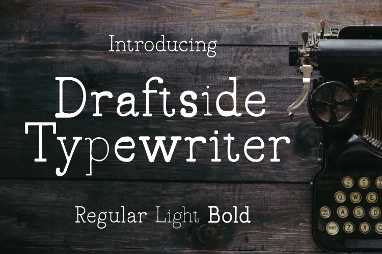
Draftside is a serif font with a vintage, typewriter-inspired aesthetic. Its clean lines and classic appearance make it suitable for body text in novels, memoirs, or historical fiction. The font’s readability and timeless charm can enhance the reader’s immersion in the story.
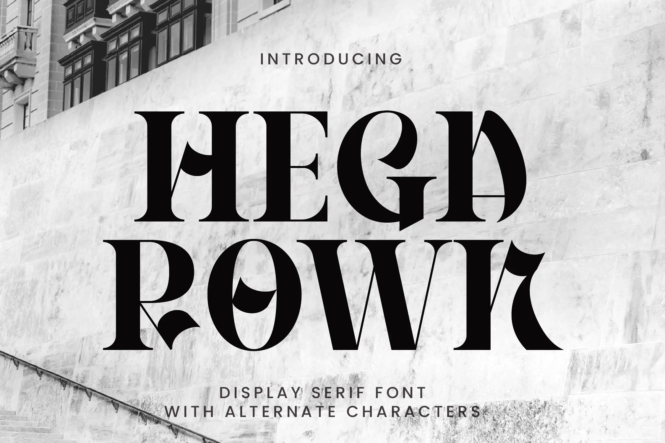
Hegarown is a display serif font characterized by its bold and elegant letterforms. While it’s more decorative, it can be effectively used for book titles, chapter headings, or section dividers, adding a touch of sophistication to the layout.
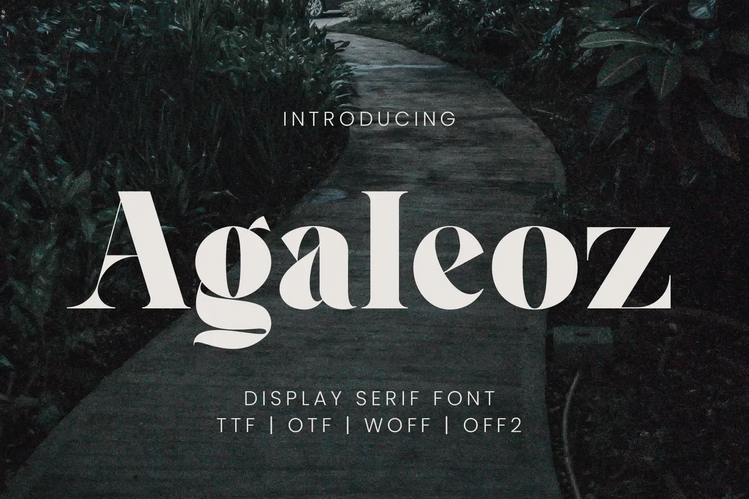
Agaleoz offers a modern take on the classic serif, with high contrast and stylish curves. It’s best suited for book covers, title pages, or introductory spreads, providing a contemporary and eye-catching appeal.

Valline Wish is a handwritten script font that brings a personal and intimate feel to the text. While not ideal for body text, it can be used for personal notes, dedications, or thematic elements within a book, especially in genres like romance or personal memoirs.

Georgia is a serif font designed specifically for screen readability, but it transitions beautifully into print. Its slightly larger x-height and wide spacing make it incredibly comfortable for the eyes. Georgia’s classical aesthetic makes it one of the best fonts for books, especially novels, biographies, and literary fiction. It’s widely available, clean, and reliable for both digital publishing and print layouts.

Helvetica is a sans-serif classic, known for its neutrality and clarity. While not traditionally used for body text in fiction, it works well in nonfiction, educational, or technical publications. Its clean lines and lack of ornamentation make it ideal for headers, callouts, and even short books or guides. For certain genres, Helvetica is a good font for books that need to project modernity and authority.

Garamond is one of the most popular serif fonts in book publishing, prized for its timeless elegance and excellent readability. It’s a favorite for novels, memoirs, and literary fiction due to its classic and comfortable design. Garamond’s efficient letter spacing also reduces page count slightly, which can save printing costs for longer manuscripts.

Another long-standing publishing favorite, Caslon is a traditional serif typeface with historic roots. It’s widely praised for its legibility and character, making it perfect for both fiction and nonfiction. Caslon works particularly well in print thanks to its fine serifs and proportional spacing.

Designed by Adobe, Minion Pro is a modern serif font often used in academic and literary publishing. Its clarity, balanced proportions, and extensive glyph set make it an ideal font for complex manuscripts. It’s highly readable and professional-looking, making it one of the best fonts for your books if you’re working on detailed content.

Baskerville offers a beautiful balance of classic structure and modern refinement. It’s slightly more dramatic than Garamond, with stronger contrast between thick and thin strokes. Baskerville is often used in literary and philosophical texts, lending an air of authority and grace.

Palatino is a large, legible serif font that’s excellent for both print and e-books. Designed for readability at smaller sizes, Palatino shines in body text, especially in poetry collections or essay-style books. Its soft, humanist features make it feel friendly and approachable.

Lora is a contemporary serif font that works well in both print and digital formats. With its balanced curves and modern aesthetic, Lora is perfect for fiction or nonfiction that aims to be accessible and visually appealing. It also pairs well with display fonts for chapter titles or section headings.

If you’re creating a non-traditional book — such as a workbook, manual, or guide — Open Sans can be a great fit. It’s a sans-serif font with clean structure and exceptional clarity, especially on screen. Open Sans is ideal for eBooks or educational content where visual fatigue must be avoided.
Choosing the best fonts for books involves more than just picking a pretty typeface. Here are essential factors every author or designer should consider:
The main goal of a book font is to make the reading experience effortless. Avoid fonts that look overly decorative or have inconsistent stroke weights. Clarity should always win over trendiness.
The standard font size for books ranges between 10pt to 12pt for printed body text, depending on the font. Fonts like Garamond may look best at 11pt, while a more compact font like Georgia could work well at 10pt.
What looks good in print may not translate well to eReaders or screen formats. Always test your font in the medium you plan to publish — or choose a hybrid font like Lora or Palatino that works well in both.
Most printed books use serif fonts for body text, as the little “feet” help guide the reader’s eye along the line. Sans-serif fonts are usually better suited for headings, modern layouts, or digital formats.
Make sure the font you choose is licensed for commercial publishing, especially if you’re releasing your book for sale. Many high-quality fonts — including those from RVANDTYPE — come with clear usage terms.
Your story deserves to be experienced, not struggled through — and choosing the best fonts for books is a critical step toward achieving that. Whether you lean toward traditional choices like Garamond and Caslon, or want to add visual personality with fonts like Gatheraz or Ravegic from RVANDTYPE, your font sets the tone long before your words do.
By considering readability, size, format, and genre, you’ll ensure your book design supports your narrative instead of distracting from it. Don’t let a poor font undermine great writing. Instead, take time to find a typeface that does your story justice — from cover to final page.
Explore creative and professional font options at RVANDTYPE.com and elevate your book design with typography that speaks to your readers.
References
https://www.ingramspark.com/blog/best-fonts-for-books
https://spines.com/choosing-the-best-fonts-for-books
What is the best font for books?
The best fonts for books are classic, readable serif fonts like Garamond, Georgia, and Caslon, which provide optimal legibility for long-form reading.
What font size is best for printed books?
The ideal font size for books typically ranges from 10pt to 12pt, depending on the typeface and format; for example, Garamond often works best at 11pt.
Are serif or sans-serif fonts better for books?
Serif fonts are generally preferred for printed books due to their readability and flow, while sans-serif fonts can be useful for headings, digital formats, or instructional content.
Can I use modern display fonts in a book?
Yes, display fonts like Ravegic or Gatheraz are great for titles, chapter headings, or cover design—but they’re not suitable for body text.
