A business card is more than just a piece of paper — it’s a miniature billboard for your brand. The layout, color, and logo matter, but typography plays a major role too. Choosing the best font for business cards can instantly communicate professionalism, credibility, and style. Whether you’re handing it out at a networking event or leaving it behind after a meeting, your business card’s font should leave a lasting impression.
In this article, we’ll explore why font choice matters, recommend some of the great fonts for business cards, and provide guidance on avoiding common mistakes — so you can create a design that speaks volumes without saying a word.
Fonts carry emotion, tone, and personality. On a business card — where space is limited — each element must work together to communicate who you are, what you do, and why you’re worth remembering. The typography sets the tone before a word is read.
Here’s why font selection is critical:
Read Also : 10 Best Fonts for Email Signature: Professional and Attractive Choices
Here’s a list of the best fonts for business cards that combine professionalism, elegance, and usability. These fonts not only look great in print but also perform well in small sizes — which is essential for business card layouts.
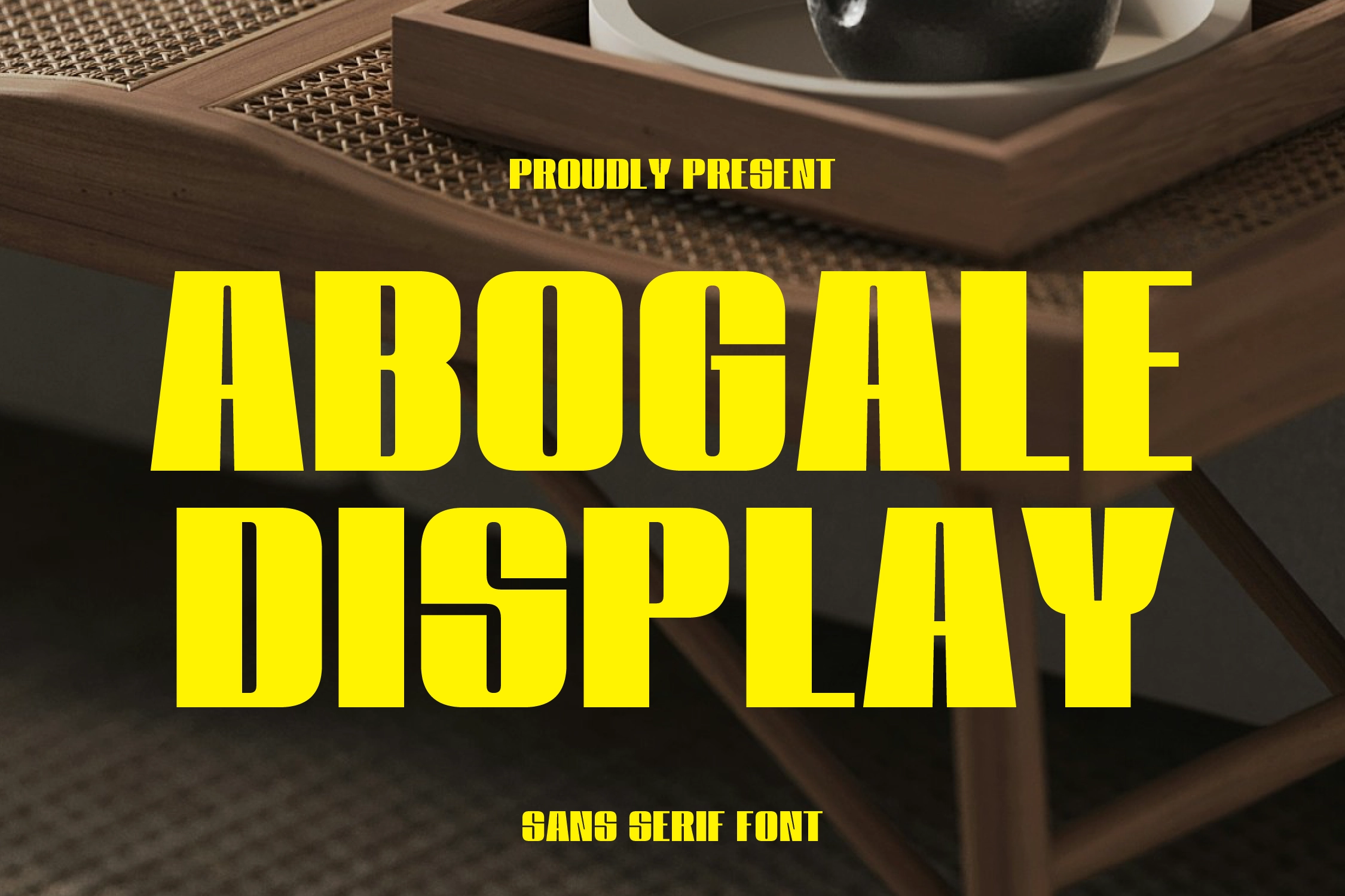
Abogale Display is a modern sans-serif font with bold character and balanced geometric proportions. Its clean and professional design makes it an ideal choice for business cards that aim to convey confidence and contemporary style. Abogale is especially well-suited for industries such as technology, design, and fashion where a sleek and elegant appearance is essential.
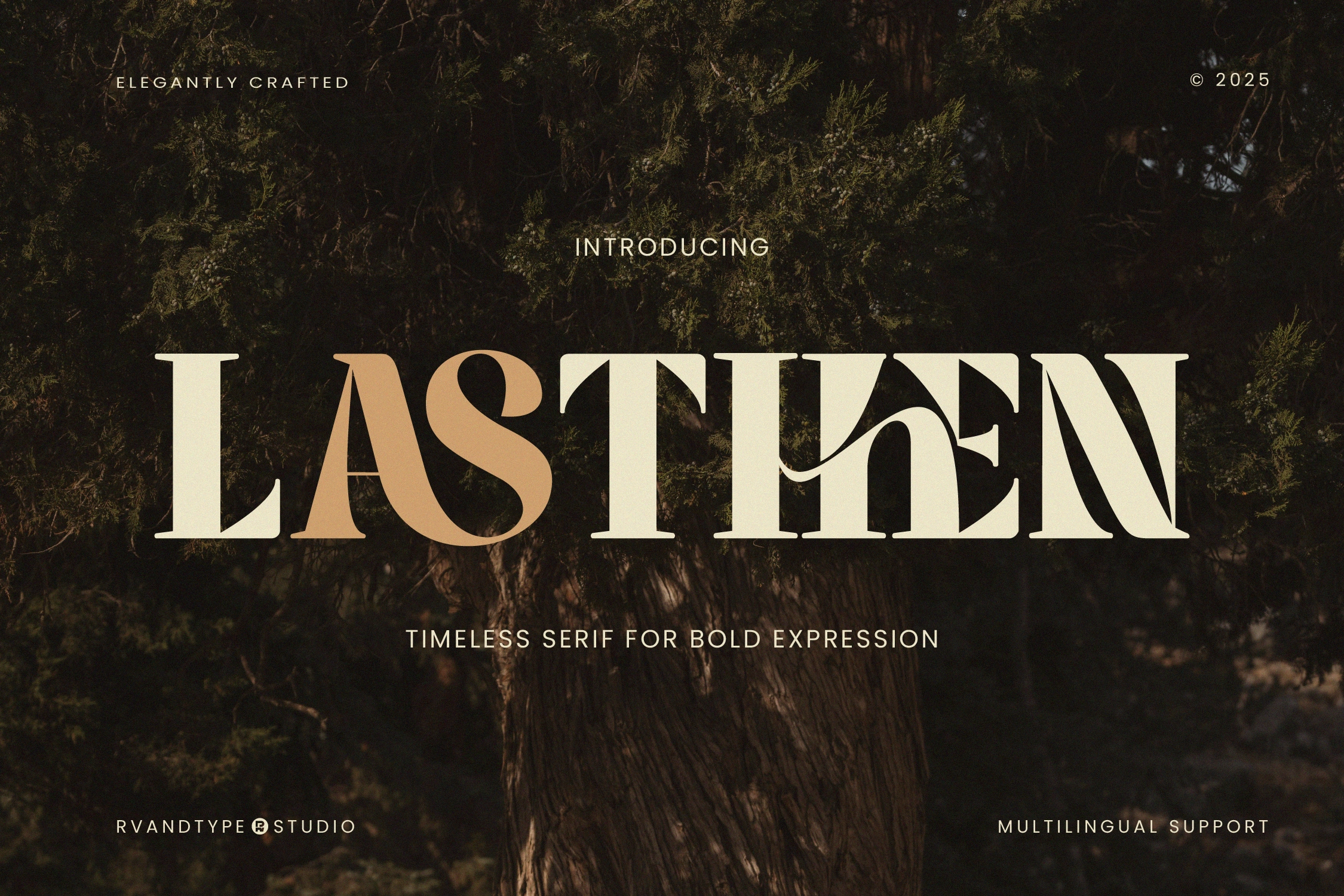
Lasthen is a bold serif font that combines visual strength with elegant detailing. Its confident, well-proportioned design makes it an excellent choice for business cards that aim to showcase a strong and professional brand identity. Lasthen is particularly well-suited for industries like law, finance, or consulting, where a firm and trustworthy impression is essential. It works exceptionally well for highlighting names or job titles, helping your card stand out while remaining highly readable. If you’re looking for a great font for business cards that conveys authority and sophistication, Lasthen is a top-tier option.
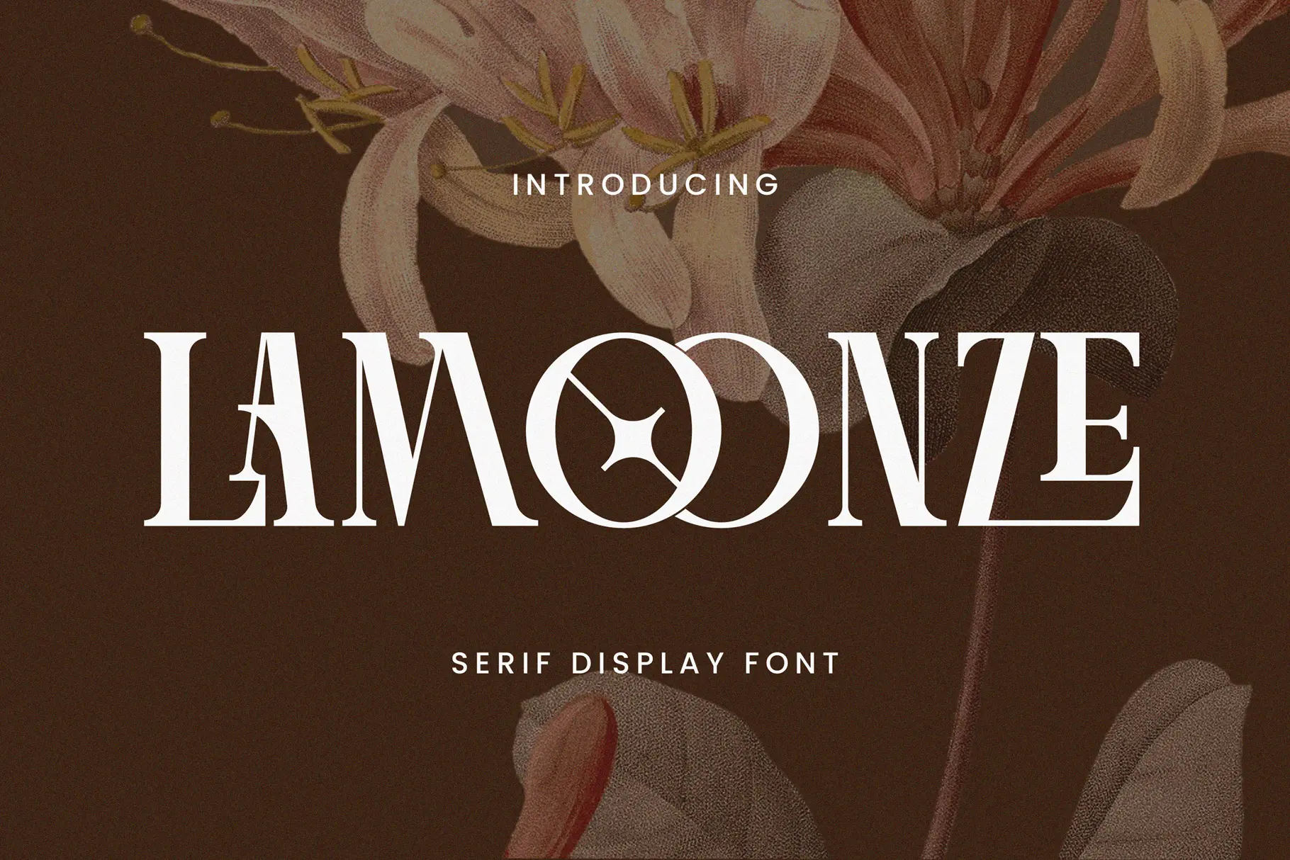
Lamoonze is a serif display font that brings together elegance and bold character in one stylish package. Its refined serifs and high-contrast strokes make it perfect for professionals looking to create a luxurious, premium impression. Whether you’re in beauty, fashion, or interior design, Lamoonze adds a sophisticated flair to your business card without sacrificing readability. It’s particularly effective when used for names or job titles. If you’re after a great font for business cards with a touch of luxury, Lamoonze delivers effortlessly.

Baskerville is a serif typeface that blends classic beauty with strong readability. It’s perfect for professional sectors like law, finance, and consulting where tradition and authority matter. The refined curves and high contrast make it easy to read even in small sizes, making it a great font for business cards where space is limited but impact is essential.

Akkurat is a neutral, modern sans-serif font praised for its minimalist style and superb legibility. It’s particularly effective in creative or tech-driven industries. Akkurat keeps your business card clean, functional, and forward-looking — ideal for conveying intelligence and innovation.

Helvetica is perhaps the most well-known sans-serif font globally. Its timeless design makes it highly versatile across all industries. Whether you’re a startup founder, consultant, or real estate agent, Helvetica works beautifully in small sizes and delivers instant clarity and trustworthiness.
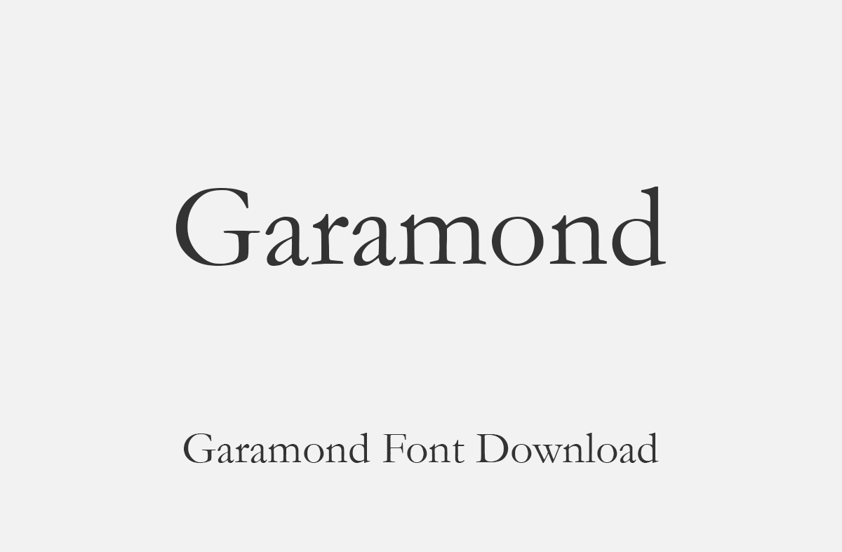
For those seeking a bit more elegance and sophistication, Garamond is a go-to serif font. Ideal for academics, writers, and consultants, it lends a refined, traditional look to your business card. Its narrow characters also help conserve space without compromising style.

Montserrat is a geometric sans-serif font with a modern, urban touch. It’s bold enough for names and titles, but neutral enough for contact info. Its clean letterforms and strong presence make it one of the great fonts for business cards in industries like marketing, media, and fashion.

Lato offers a friendly, approachable feel without losing professionalism. This sans-serif font is highly legible and modern, ideal for personal brands and service-oriented businesses. Lato’s curved lines and consistent rhythm make it a good font for business cards that aim to build rapport and trust.

Futura is a classic geometric font with strong, clean lines. Its futuristic look adds a sleek vibe to your business card, great for tech companies or forward-thinking entrepreneurs. The clarity and balance in Futura’s design make it a reliable pick when aiming for impact and professionalism.
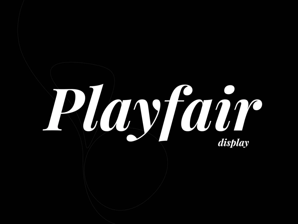
If you’re in a luxury industry — like fashion, interior design, or high-end consulting — Playfair Display can bring the elegance your brand needs. This serif font stands out beautifully in large text (like your name), giving your card a distinctive and classy touch.
Even with the best font for business cards, poor execution can dilute your design. Here are key mistakes to avoid:
One of the most common errors is choosing a font size that’s unreadable. The ideal font size for business cards is between 10pt to 12pt for body text. Names and titles can go up to 14pt–16pt, depending on the layout.
Fonts with extreme curves, excessive swashes, or unnecessary ornaments may look cool — but they’re often hard to read in small sizes and across print mediums. Stick to fonts with clean lines and solid spacing.
Limit your design to one or two fonts — for example, one for your name/title and another for contact information. More than two fonts can clutter the card and look unprofessional.
A mismatch between your business card font and your website or logo can confuse clients and weaken brand consistency. Always choose fonts that align with your overall visual identity.
Some digital fonts don’t translate well in print, especially if they’re lightweight or ultra-thin. Always test-print your design to ensure clarity and sharpness.
Your business card might be small, but its influence is powerful. Choosing the best font for business cards ensures that your card communicates professionalism, clarity, and your brand’s unique tone — all at a glance. Whether you opt for the classic authority of Baskerville, the clean sharpness of Helvetica, or modern options like Afgeta and Sifonn from RVANDTYPE, there’s a perfect typeface waiting to represent you.
Remember, even good fonts for business cards won’t shine unless they’re sized correctly, printed well, and thoughtfully placed. Aim for 10pt–12pt font size for body content and keep the layout minimal yet informative.
If you’re ready to design a card that leaves a lasting impression, start by exploring professional font options that match your brand’s character. For unique and impactful font selections, be sure to check out RVANDTYPE.com — where creativity meets precision in every typeface.
What is the best font for business cards?
The best fonts for business cards are clean, readable, and professional — such as Baskerville, Helvetica, Garamond, Montserrat, and Afgeta (by RVANDTYPE).
What font size should I use for a business card?
The ideal font size for business cards is typically between 10pt–12pt for contact details and 14pt–16pt for names or job titles, depending on layout and font style.
What makes a good font for business cards?
A good font for business cards offers strong readability at small sizes, reflects your brand identity, and prints well on physical media.
Can I use two different fonts on a business card?
Yes, you can use two complementary fonts — one for your name/title and one for contact info — to create visual hierarchy, but avoid using more than two.
