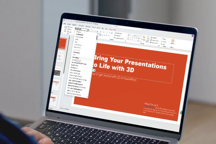
When delivering a powerful presentation, content is crucial—but design is what keeps your audience engaged. One of the most overlooked design choices? Typography. The best font for PowerPoint can dramatically elevate your presentation, boost clarity, and hold attention from slide one to the final call to action.
In this article, we’ll walk you through why font choice is critical, showcase the best fonts for PowerPoint presentations, including standout picks from RVANDTYPE, and share font usage best practices to help you create clean, professional, and unforgettable slide decks.
Read Also : 14 Best Fonts for Logos and Tips for Choosing the Perfect Style
Whether you’re presenting to colleagues, clients, investors, or a classroom, your slides need to communicate clearly and look polished. Poor font choices can break that flow, confuse your audience, or even make your message unreadable.
Here’s why font selection matters:
Choosing the best font for PowerPoint slides ensures your message is heard, not lost in clunky text or poor formatting.
Here’s our curated list of fonts that work well on PowerPoint, whether for business reports, startup pitches, or educational seminars.
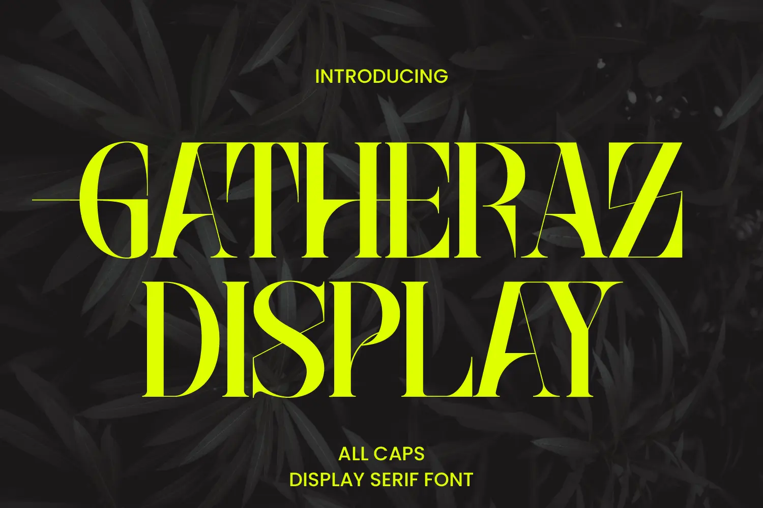
Gatheraz Display is an all-caps serif font that exudes boldness and sophistication. Its sharp serifs and high-contrast strokes make it ideal for commanding attention in presentation titles and key statements. The font’s strong presence ensures that your main points stand out, making it a valuable asset for presentations in fields like law, finance, or corporate strategy. Gatheraz Display adds a touch of elegance while maintaining clarity and professionalism.
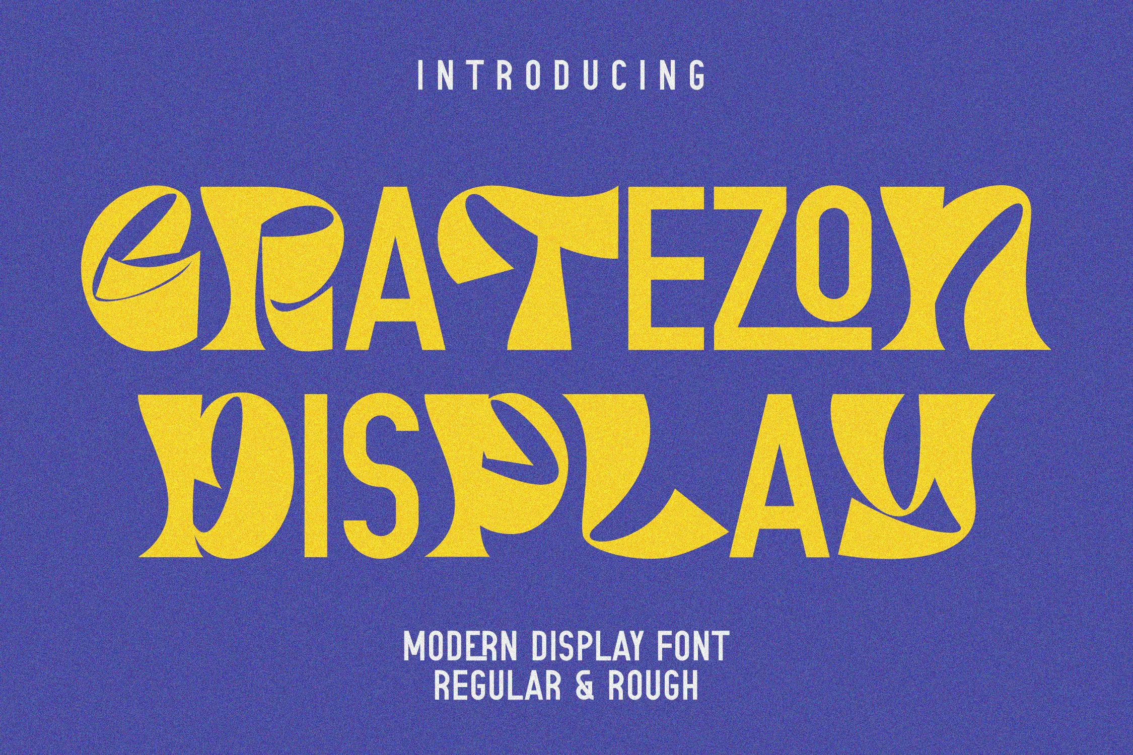
Gratezon is a bold and stylish display font designed to capture attention immediately — perfect for slide titles and standout messages in a presentation. Its sharp edges and geometric structure create a modern and impactful aesthetic, making it ideal for industries like tech, marketing, and design. While best used for headings or callout sections, it pairs well with cleaner body fonts for a balanced look. If you’re aiming to make a bold statement in your slides, Gratezon is a powerful choice among the best fonts for PowerPoint presentations.
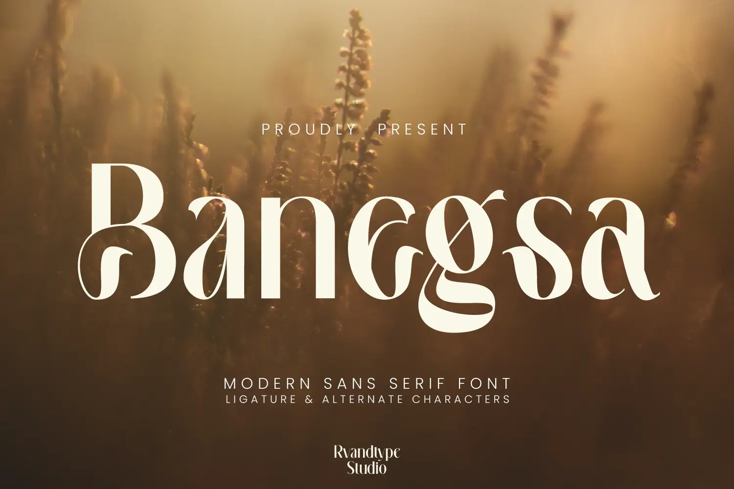
Banegsa is a strong and confident display font with bold letterforms and a striking presence. Designed to grab attention, it works especially well for slide titles, key quotes, or major stats in PowerPoint presentations. Its unique style gives your content a powerful edge, making it ideal for creative fields, branding presentations, or product pitches. While not intended for body text, Banegsa’s standout look makes it one of the best fonts for PowerPoint slides when used for emphasis. If your goal is to keep your audience focused on the message, Banegsa delivers the punch.

Ravegic is a bold and assertive display serif font that combines classic elegance with modern flair. Its thick letterforms and unique character make it ideal for commanding attention in presentation titles and key statements. Ravegic’s creative letterforms and decorative elements add a distinctive touch, making your slides stand out while maintaining readability. This font is particularly well-suited for branding, packaging, and editorial designs that aim to leave a lasting impression. Incorporating Ravegic into your PowerPoint presentations can elevate the aesthetic appeal, providing a perfect blend of creativity and professionalism that engages and inspires viewers.

Roboto is a go-to font for presentations, offering excellent readability, neutral tone, and sleek modernity. Its sans-serif structure gives it clean edges that project well on screens and printed materials. Roboto works well for both headers and body content, making it one of the best fonts for PowerPoint presentations across industries. It’s especially suitable for tech, corporate, and educational slides.

Tahoma is known for its tight letter spacing and excellent screen clarity. Designed specifically for digital display, Tahoma is ideal when you need to pack more content into your slides without sacrificing readability. Its legibility and professional tone make it one of the best fonts for PowerPoint presentation layouts that rely on bullet points and detailed data.

Lato brings a soft, modern feel to your slides. With semi-rounded details and good spacing, it balances professionalism with friendliness. It’s easy to read on any screen, which makes it one of the best fonts for PowerPoint slides — especially for service-based industries or educational content.

Montserrat is a bold geometric sans-serif font perfect for headlines. Its strong structure ensures high impact and excellent visibility, particularly on title slides or key callouts. Montserrat’s sleek design makes it perfect for modern business and marketing presentations.

A classic default font in many Microsoft applications, Calibri is a safe and readable choice. Though not the most visually distinctive, it’s widely supported and consistent across platforms. For formal presentations where clarity matters more than design flair, Calibri remains one of the good fonts for PowerPoint presentation layouts.

Open Sans is a neutral, user-friendly sans-serif font that’s excellent for body text. Designed with digital screens in mind, it maintains readability even at smaller sizes. It’s ideal for content-heavy slides, educational materials, and corporate reports.

For presentations that need a touch of elegance, Playfair Display offers serif styling with a modern twist. It’s best used for slide titles or impactful quotes rather than large blocks of text. Ideal for fashion, luxury branding, or high-end marketing decks.

Verdana was designed specifically for screen readability. With generous spacing and clean lines, it’s one of the most legible fonts for presentations. It works particularly well for technical, academic, or detail-rich presentations where clarity is key.
Even the best font for PowerPoint won’t help if it’s poorly used. Here are essential typography rules for presentations:
By following these guidelines, your presentation remains visually cohesive and easier to follow — boosting its impact and professionalism.
Read Also : 12 Best Fonts for Websites Make Your Site Look Clean and Professional
Choosing the best font for PowerPoint isn’t just about looks — it’s about communication, clarity, and credibility. From universally trusted fonts like Roboto and Tahoma to modern and creative options like Afgeta, Abogale, and Lasthen from RVANDTYPE, there’s a perfect typeface for every purpose and audience.
Remember, your font should complement your content, support your visuals, and help deliver your message with impact. By keeping readability, tone, and consistency in mind, you’ll build a presentation that not only informs but also captivates.
Ready to upgrade your slide game? Start by selecting a professional, versatile font — and visit RVANDTYPE.com to explore premium fonts that can elevate every presentation you give.
What is the best font for PowerPoint presentations?
The best font for PowerPoint presentations is one that’s highly readable, clean, and professional — popular choices include Roboto, Tahoma, Lato, and Montserrat.
Which font is best for PowerPoint slides with a lot of text?
For content-heavy slides, sans-serif fonts like Open Sans, Lato, or Verdana are ideal because they remain clear even in smaller sizes and on various screens.
Can I use display fonts in PowerPoint presentations?
Yes, but use them for headings or key phrases only. Display fonts like Gratezon or Ravegic (by RVANDTYPE) are great for emphasis but should be paired with simpler fonts for body text.
How many fonts should I use in a PowerPoint presentation?
It’s best to use no more than two fonts—one for headings and one for body text—to maintain consistency and avoid distracting your audience.
